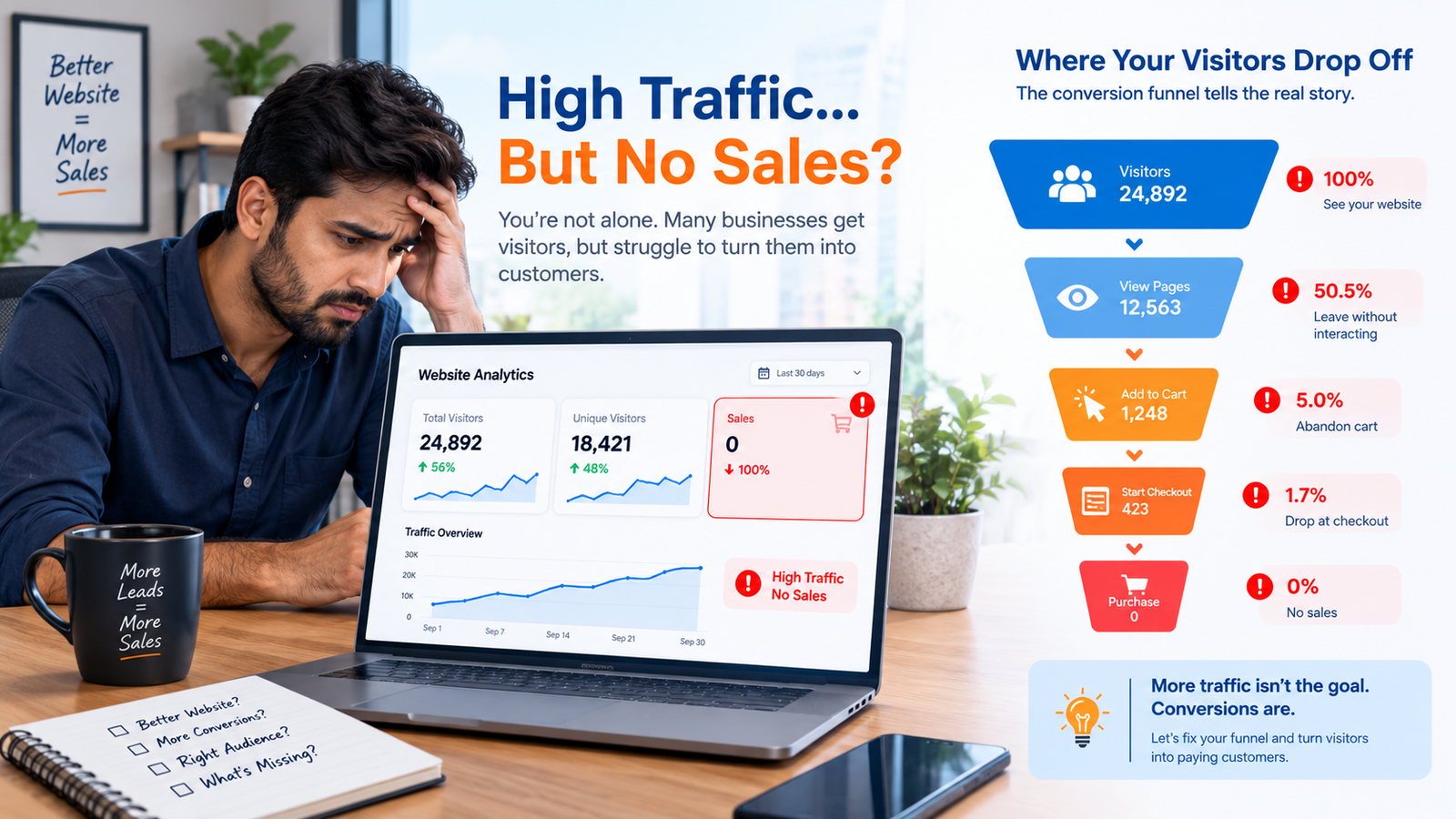
High Traffic but Zero Sales? 5 Hidden UX Flaws Costing You Customers (And How to Fix Them)
You are doing everything right. You are running ads. You are ranking on Google. You are posting on social media. Your analytics show hundreds — maybe thousands — of visitors every day.
But your sales? Flat. Your contact forms? Empty. Your shopping carts? Abandoned.
You are paying for traffic that is not converting. And it is bleeding your budget dry.
Here is what most business owners do not realize: the problem is not your traffic. The problem is your user experience.
According to research, the average website converts just 2.35% of visitors. That means 97 out of every 100 people who visit your website leave without taking action. And the top-performing websites? They convert at 5.31% or higher — more than double the average.
The difference is not luck. It is UX.
In this guide, I will show you 5 hidden UX flaws that are silently killing your conversions — and exactly how to fix them.
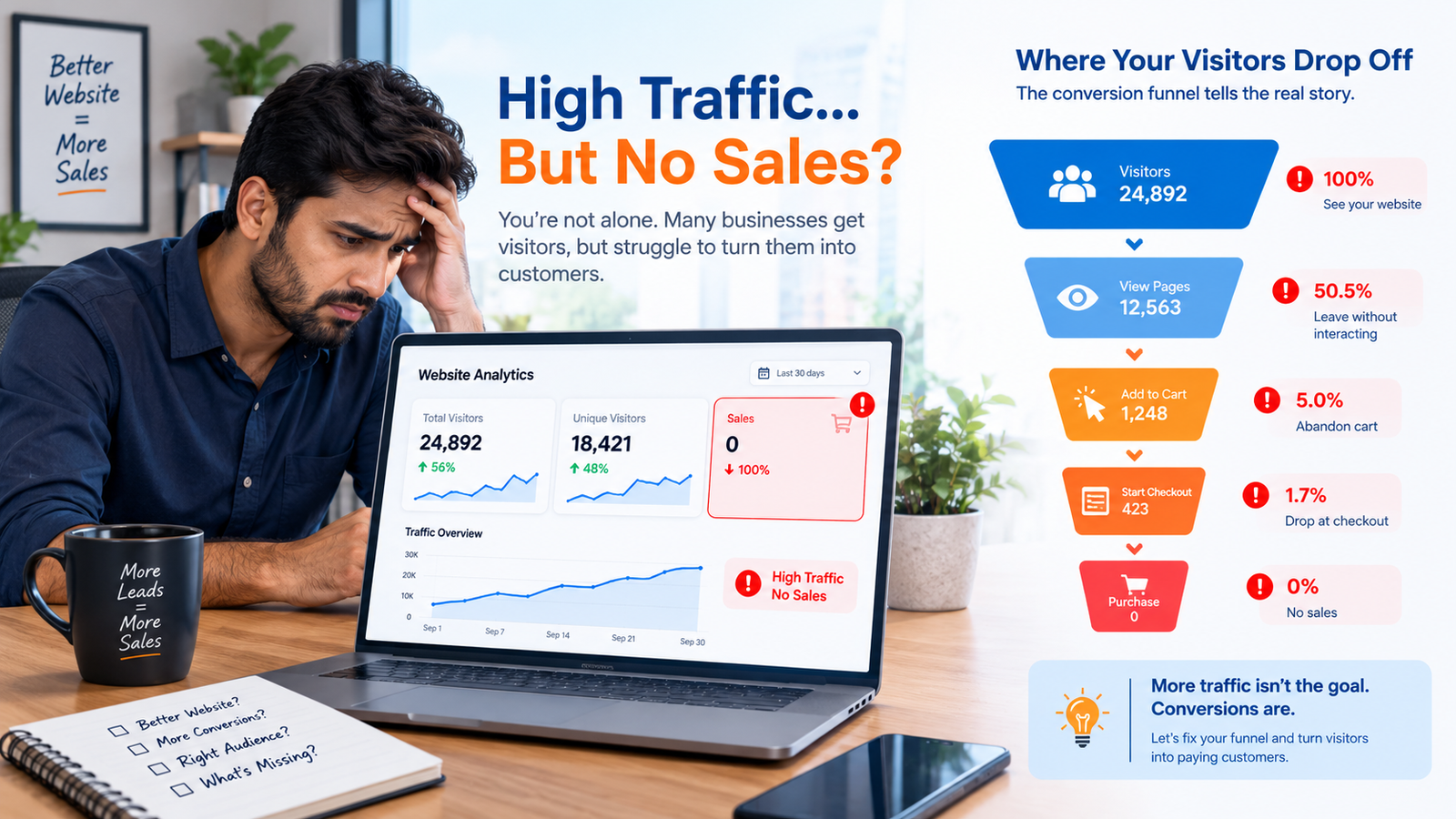
Image: High traffic means nothing if your UX is driving visitors away.
Flaw #1: Confusing Navigation That Makes Visitors Leave
When someone lands on your website, they are asking one question: "Can I find what I need here?"
If the answer is not immediately obvious, they leave. It is that simple.
Confusing navigation is the silent killer of conversions. Here is what it looks like:
- Too many menu items — 10, 15, 20 links in the top bar
- Unclear labels — "Solutions" instead of "Pricing" or "Services"
- No search function — visitors cannot find what they want
- Hidden contact information — no phone number, no email, no chat
- Broken links — clicking through to 404 errors
Visitors do not have patience for navigation that wastes their time. Research shows that pages with a single clear action outperform those with scattered actions by 20-28%. When users see one clear path, they follow it 2-3x more often.
How to fix it: Simplify. Keep your navigation to 5-7 items maximum. Use clear, descriptive labels. Add a search bar. Make your contact information visible on every page.
Flaw #2: Weak Call-to-Action (CTA) Buttons That Nobody Clicks
Your CTA button is the most important element on your website. It is the moment where a visitor becomes a customer.
But most businesses get it wrong.
Here is what weak CTAs look like:
- "Submit" — vague and boring
- "Click Here" — meaningless
- "Learn More" — does not create urgency
- Low contrast buttons — visitors do not even see them
- Multiple competing CTAs — visitors do not know what to click
Your CTA needs to be clear, action-oriented, and impossible to miss.
How to fix it: Use action-oriented language that tells visitors exactly what they will get. Instead of "Submit," use "Get Your Free Quote." Instead of "Click Here," use "Book Your Consultation." Instead of "Learn More," use "Start Your Free Trial."
Place your CTA where visitors are ready to act — after they have seen value, not before. And make it stand out with contrasting colors.
Flaw #3: A Checkout Process That Makes Customers Give Up
For e-commerce businesses, the checkout process is where money is made or lost.
And most checkouts are broken.
Here is why customers abandon their carts:
- Forced account creation — "Create an account to checkout"
- Too many form fields — asking for information you do not need
- Hidden costs — shipping charges appear at the last step
- No guest checkout — forcing registration before purchase
- Confusing payment options — too many choices, unclear steps
- Slow loading — each step takes seconds to load
Research shows that 53% of mobile users abandon sites that take longer than 3 seconds to load. And cart abandonment rates average around 70% across all industries.
Every extra step, every unnecessary field, every second of delay costs you customers.
How to fix it: Simplify your checkout. Allow guest checkout. Show all costs upfront. Reduce form fields to the bare minimum. Offer multiple payment options. Make it fast and frictionless.
Flaw #4: No Trust Signals — So Visitors Do Not Believe You
People buy from businesses they trust. If your website does not build trust, visitors will not convert.
Here is what lack of trust signals looks like:
- No testimonials — no proof that you have satisfied customers
- No case studies — no evidence that you deliver results
- No client logos — no credibility from recognizable brands
- No reviews or ratings — no social proof
- No security badges — no indication that payment is safe
- No physical address or phone number — looks like a scam
Visitors are skeptical. They have been burned before. They need evidence that you are legitimate and that you can deliver.
How to fix it: Add testimonials with real names and photos. Show case studies with measurable results. Display client logos. Add security badges near payment forms. Include your physical address and phone number. Every trust signal increases the likelihood of conversion.
Flaw #5: Slow Loading Speed That Drives Visitors Away
Speed is not a luxury. It is a conversion requirement.
Research shows that 53% of mobile users abandon sites that take longer than 3 seconds to load. Every second of delay costs you conversions.
But most business owners do not realize their website is slow. They test it on their own computer, with a fast internet connection, and it feels fine. But their customers are on mobile devices, with slower connections, in areas with poor network coverage.
Here is what slows down your website:
- Unoptimized images — huge files that take forever to load
- Too many plugins — each one adds weight
- Cheap hosting — slow servers that cannot handle traffic
- Bloated code — templates with unnecessary features
- No caching — every visit loads everything from scratch
How to fix it: Compress your images. Remove plugins you do not use. Upgrade your hosting. Use a CDN. Cache your website. Aim for under 3 seconds on a normal mobile connection.
The Real Cost of UX Flaws
Let me show you the math.
Imagine you get 10,000 visitors per month. Your average conversion rate is 1%. That means 100 customers per month.
Now imagine you fix your UX flaws and your conversion rate goes to 3%. That means 300 customers per month.
Three times the customers. Same traffic. Zero extra ad spend.
If your average customer is worth $100, that is an additional $20,000 per month — just from fixing your UX.
Why Choose WebStudioLabs for UI/UX Redesign & CRO
At WebStudioLabs, we do not just build websites — we build conversion engines.
Here is what we do:
- UX Audit: We analyze your website and identify exactly where visitors are dropping off and why.
- UI/UX Redesign: We redesign your website to remove friction, build trust, and guide visitors toward conversion.
- Conversion Rate Optimization (CRO): We test, measure, and optimize every element — headlines, CTAs, forms, checkout flows — to maximize conversions.
- Performance Optimization: We make your website fast — under 3 seconds load time, every time.
- Mobile-First Design: We ensure your website works perfectly on every device, because most of your visitors are on mobile.
We have helped businesses across industries — e-commerce, SaaS, healthcare, real estate, education — turn their websites into lead generation machines.
Whether you are a small business owner in MP Nagar, Bhopal, or an enterprise in Mumbai, we can help you turn more visitors into customers.
Final Thoughts
High traffic with zero sales is not a traffic problem. It is a UX problem.
If 97 out of 100 visitors are leaving without taking action, you are leaving money on the table. Every day you wait is another day of lost opportunities.
The good news? You can fix this. A conversion-optimized website can 2.4x your conversion rate — turning the same traffic into significantly more customers.
Ready to fix your UX and triple your conversions? Contact WebStudioLabs today and let us build a website that actually works for your business.
WebStudioLabs specializes in UI/UX Redesign and Conversion Rate Optimization. Book a free website audit today.
Check out our Lead Generation Tool here
Have Questions or Need Custom Features?
Connect directly with Rishi Koushal (10+ years engineering experience). Get instant technical support, code customizations, or project estimates on WhatsApp.